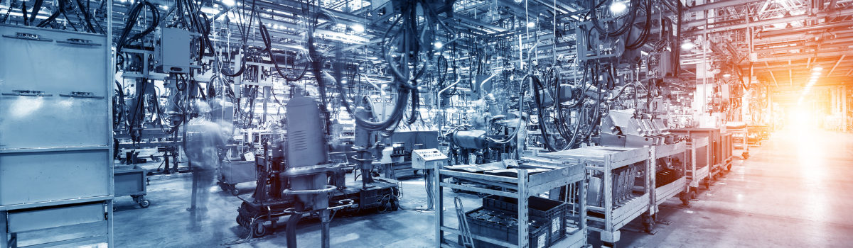
Navigating economic challenges in the automotive parts industry
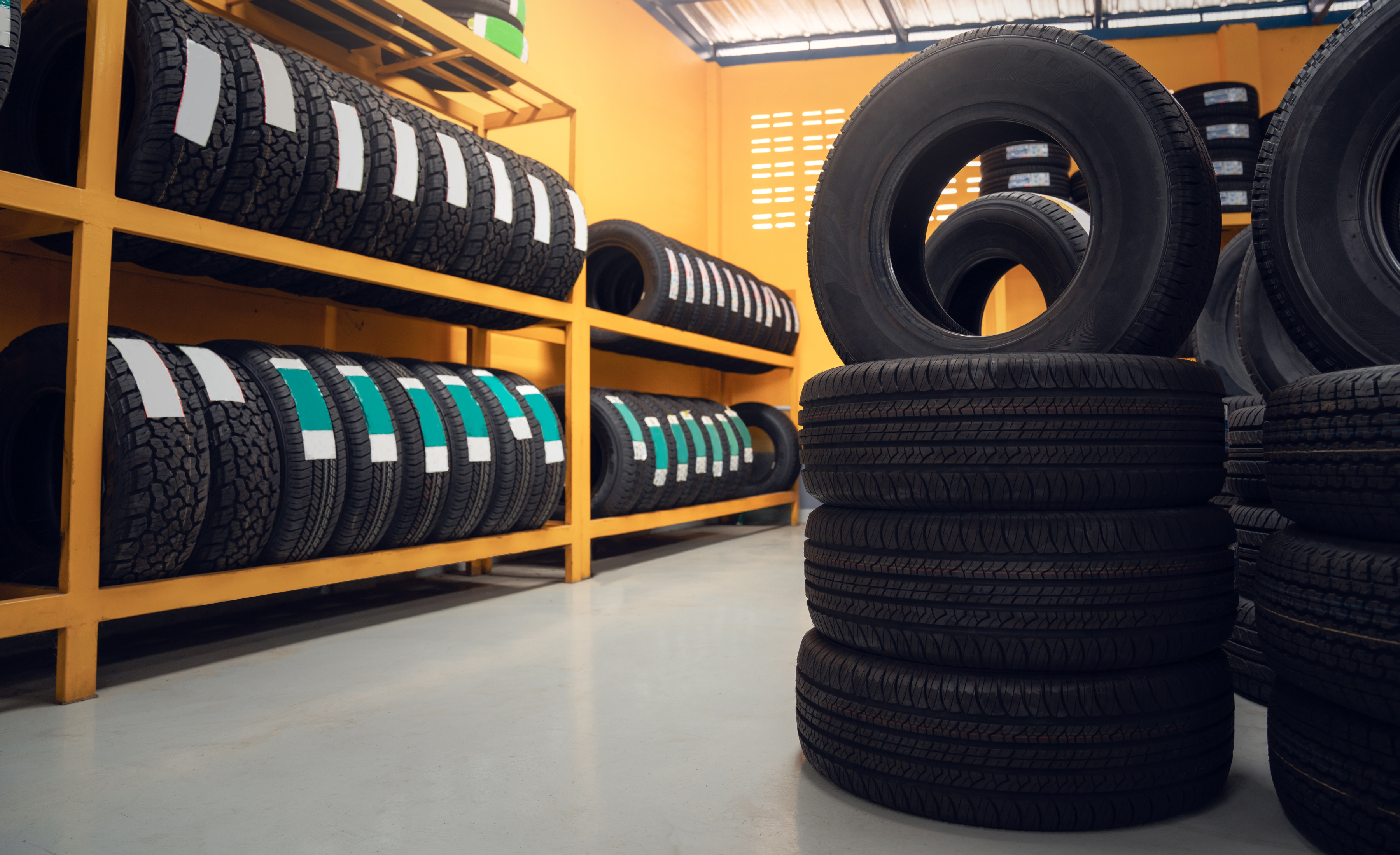
Navigating economic challenges in the automotive parts industry
Apr 14, 2025 1:25:16 PM
7
min read
Connecting SaaS products to ERP with Eversource’s eProcurement solution

Connecting SaaS products to ERP with Eversource’s eProcurement solution
Sep 18, 2024 1:50:59 PM
7
min read
MYOB Advanced rebrands to MYOB Acumatica

MYOB Advanced rebrands to MYOB Acumatica
Jul 16, 2024 1:01:33 PM
2
min read
Elevating efficiency for healthcare and medical wholesale and distribution and manufacturing businesses
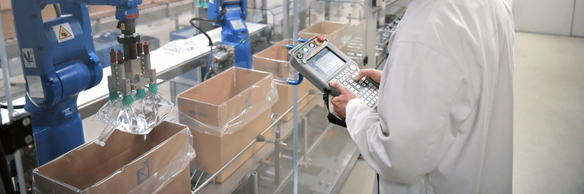
Elevating efficiency for healthcare and medical wholesale and distribution and manufacturing businesses
Jun 10, 2024 11:25:17 AM
5
min read
Excellence in the building products sector
Excellence in the building products sector
Apr 30, 2024 11:31:04 AM
9
min read
The Future of Transport Management: The Advantages of a TMS ERP Integration
The Future of Transport Management: The Advantages of a TMS ERP Integration
May 9, 2023 11:47:10 AM
4
min read
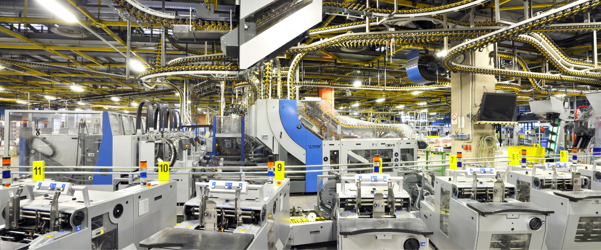
The future of manufacturing is digital
The future of manufacturing is digital
Apr 20, 2023 11:43:04 AM
5
min read
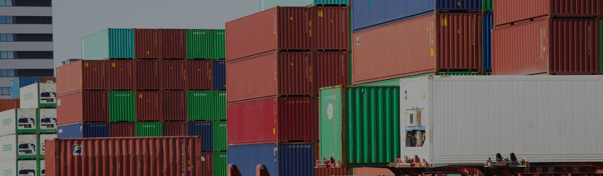
Meeting the challenges of modern supply chain management

Meeting the challenges of modern supply chain management
Feb 15, 2023 1:47:19 PM
3
min read
Facing the challenges of shifting market conditions and rising costs?

Facing the challenges of shifting market conditions and rising costs?
Oct 27, 2022 7:20:20 PM
5
min read